ShopDreamUp AI ArtDreamUp
Deviation Actions


Suggested Deviants


Suggested Collections


You Might Like…


Featured in Groups


childchildhoodchildrenfanartfanartanimefanartdrawingfanartfanartpenandinkpenandinkdrawingpenandinkdrawingstraditionaltraditionalarttraditionaldrawingtraditionalmediachildchildrenfanartfanpenandinksketchtraditionalfanarttraditionalillustrationblazbluepenandinkillustrationfanartvideogamespenandinkartpenandinkartworkragnathebloodedgeragna_the_bloodedgeblazblueragnafanarttraditionalart
Description
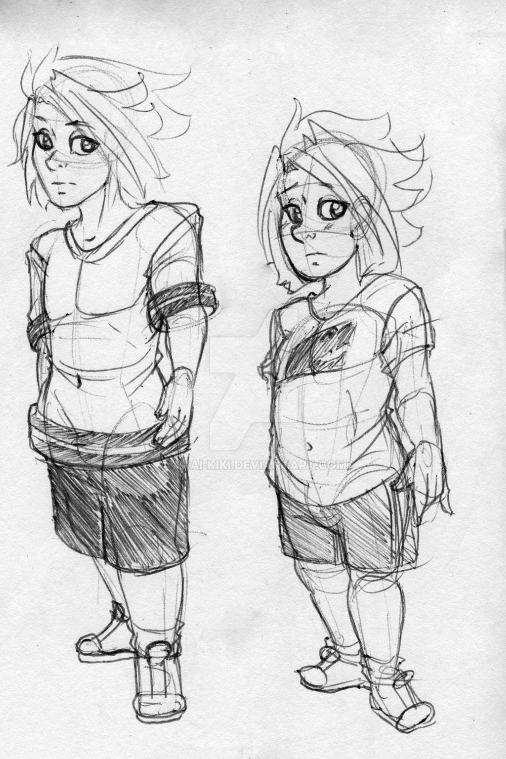
Welp, here's more comic concept art! I cut out the notes because haha, my handwriting is messy af.
Normal child Ragna is on the left, the one for my comic is on the right. The big difference is obviously his age. He's younger, rounder, has a lot more baby fat, and bigger eyes. I tried to make him, well, cuter, I guess.
Not sure if I'll use the Dead Spike shirt, but he's probably gonna have a few different printed T-shirts. I wanted his design to give that slight sense that the Sister was doting on him more than she did in the canon story.
I should be uploading a bit more concept art in the days to come, as well as some general fanart and OC stuff! Look forward to it~.
Image size
1555x2330px 3.07 MB
Comments67
Join the community to add your comment. Already a deviant? Log In
Hello I am from 
What I love about your drawing.
1. I love concept art. I know a lot of people don't like it because they feel it is incomplete but I love how it shows the creative process.
2. You did a nice job of aging the character while still maintaining Ragna's physical characteristic traits, like the eyes and hair.
3. You have created a real great body language to the character. He's a bit casual and looks really comfortable in his clothes.
Now a few aspects of the drawing you might consider working on.
1. As I said I love the concept art concept however, there does seem to be quite a few lines especially in young Ragna's shirt. It's hard to make out what is shirt and what is body. Maybe cleaning it up a bit might make it a bit clearer to the viewer.
2. I might have added just a bit of shading under their feet. This would help to give them some weight. Right now young and older Ragna just seem to be floating. Nothing wrong with giving the drawing a more completed feeling. (Smile)")
Overall a great drawing that is really appealing to the eye. Keep up the terrific work.
What I love about your drawing.
1. I love concept art. I know a lot of people don't like it because they feel it is incomplete but I love how it shows the creative process.
2. You did a nice job of aging the character while still maintaining Ragna's physical characteristic traits, like the eyes and hair.
3. You have created a real great body language to the character. He's a bit casual and looks really comfortable in his clothes.
Now a few aspects of the drawing you might consider working on.
1. As I said I love the concept art concept however, there does seem to be quite a few lines especially in young Ragna's shirt. It's hard to make out what is shirt and what is body. Maybe cleaning it up a bit might make it a bit clearer to the viewer.
2. I might have added just a bit of shading under their feet. This would help to give them some weight. Right now young and older Ragna just seem to be floating. Nothing wrong with giving the drawing a more completed feeling.
Overall a great drawing that is really appealing to the eye. Keep up the terrific work.